(or … what’s the difference between RGB and CMYK colors?)
Our clients often ask Morpho Printing Bentonville, why does my printed design file look a little bit darker and a little bit different colors from what I see on my screen, on both my laptop and my desktop PC, and on my phone? This is a universal challenge and a question that exists worldwide for several reasons, the first of which is that monitors only have three colors and that’s RGB, which stands for red, green and blue. And they are emitting light using little tiny light emitting diodes (LED’s) behind the screen that actually give off light. You’ve seen that in a dark room when the monitor is the brightest thing in the room. So that is what is called emissive light or our background light.
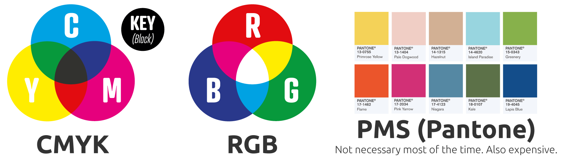
Printed pieces are always using CMYK, which stands for cyan, yellow, magenta and black. Sometimes the K stands for “Key”. But when a printed piece is. In front of a person, it is reflecting light that comes from above. Sometimes that light is the temperature of the sun and is “full spectrum” light. Sometimes that light is the temperature of a yellowish light bulb that we often have in our homes. Sometimes that light is the temperature of an office fluorescent, which is mostly white, but sometimes leans towards being blue. And so it’s reflecting the actual color temperature on the spectrum wavelength of the light that is in the room when you’re looking at the piece. At Morpho Printing Bentonville we have 5,000 degree Kelvin overhead lamps to give a very consistent “white” light for quality control. But most folks can’t necessarily control the type of light that’s being reflected, that is to say, the color of the light and we can’t control how much light is being reflected off the printed piece. So we have four or five variables that interact with each other that create the difference between what you see on the monitor versus what you see on paper in print at Morpho Printing Bentonville.
Also be aware that many monitors, in fact 98% of the monitors in offices, are not calibrated to any known standard. In other words, the user can add a little bit more green, or a little bit more red or a little bit more blue to the monitor to suit their needs, and oftentimes at 7:00pm at night, the monitor purposely removes some of the blue light to reduce eye strain. We notice at Morpho Printing Bentonville that the color standard of the monitor changes based on who is operating the monitor, where it’s sitting, how much light is reflected onto the monitor, and the various user selectable. Color settings of the monitor. The only way to have a monitor that’s calibrated is to use a color light probe on the monitor to calibrate it to a known standard, and that is done in many, many graph design facilities like ours. Our monitors at Morpho Printing Bentonville are calibrated to a known standard, so we know that they are all consistent. Among each other and the consistent across our office.
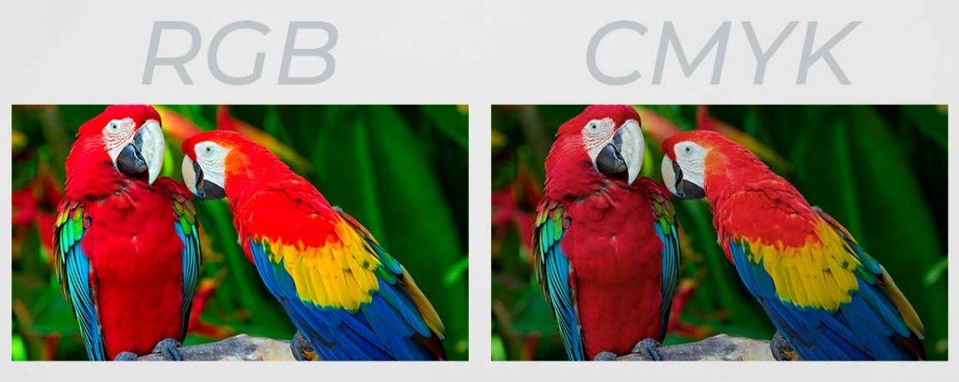
RGB that appears on our monitors has upwards of 16,000,000 color combinations and usually is much brighter in terms of perception than on printed documents. On the monitor you can get extremely bright neon greens and oranges and neon reds and neon pinks because of the nature of the RGB color, but mostly those neon colors, those fluorescent colors are not possible when using CMYK for printing using ink and so CMYK colors on paper are usually much more accurate to real life and less cartoonish and less gaudy and less super brilliant, but in reality are more accurate in terms of color, which is what clients REALLY appreciated from Morpho Printing Bentonville once they are educated and see the accuracy of their printed pieces at Morpho Printing Bentonville.
So occasionally clients say to us, “Oh, my goodness, you’re printing is so much less vibrant and less brilliant and less fluorescent than what I saw on the screen when I was designing the project!” And that is true because the nature of printing has for decades only used 4 ink colors in printing and that is the nature of CMYK inks. So it’s a reflective project and reflective media. And so it also depends on the type of paper we’re printing on. Glossy paper tends to reflect the colors more brilliantly. And matte paper tends to not reflect the light and the colors as brilliant as glossy paper. And so because we’re using 4 main colors of ink at Morpho Printing Bentonville, the reflected light will never be as brilliant or as bold and bright as the emitted light from an LCD screen or a monitor or a phone.
So in reality, 99% of professionally designed printed marketing pieces by graphic designers are always output to a PDF file format in a CMYK mode when we take that file in at Morpho Printing Bentonville, we run it through special software to catch or flag low resolution images and any images that are in the file that are RGB in nature. And oftentimes people will grab an RGB image from a Google search, a Google image search, and that image is indeed RGB, but the only way for a printing company like ours at Morpho Printing, Bentonville, to print that piece is to print it using four colors of ink, CMYK. So therefore we have to convert the RGB image to CMYK, and there’s a mathematical conversion to get from three colors to four colors and usually that’s pretty accurate, but sometimes it’s not. And so we will always flag the RGB images and let you know, “Hey, this RGB image may shift color a little bit!” We’re not talking about going from green to red or from blue to yellow, but it might be a slightly different red or slightly different blue, usually a little bit darker in print that was viewed on your RGB screen and usually a little bit more accurate and so that’s why we always recommend getting sources of pictures for your files in CMYK and that way that conversion won’t take place and you will see on print in paper at Morpho Printing Bentonville what you see on your screen during the design process or at least a much more accurate representation.